Quotes pro en anti het lettertype Helvetica uit de documentaire 'Helvetica' weergeven op een typografische manier.
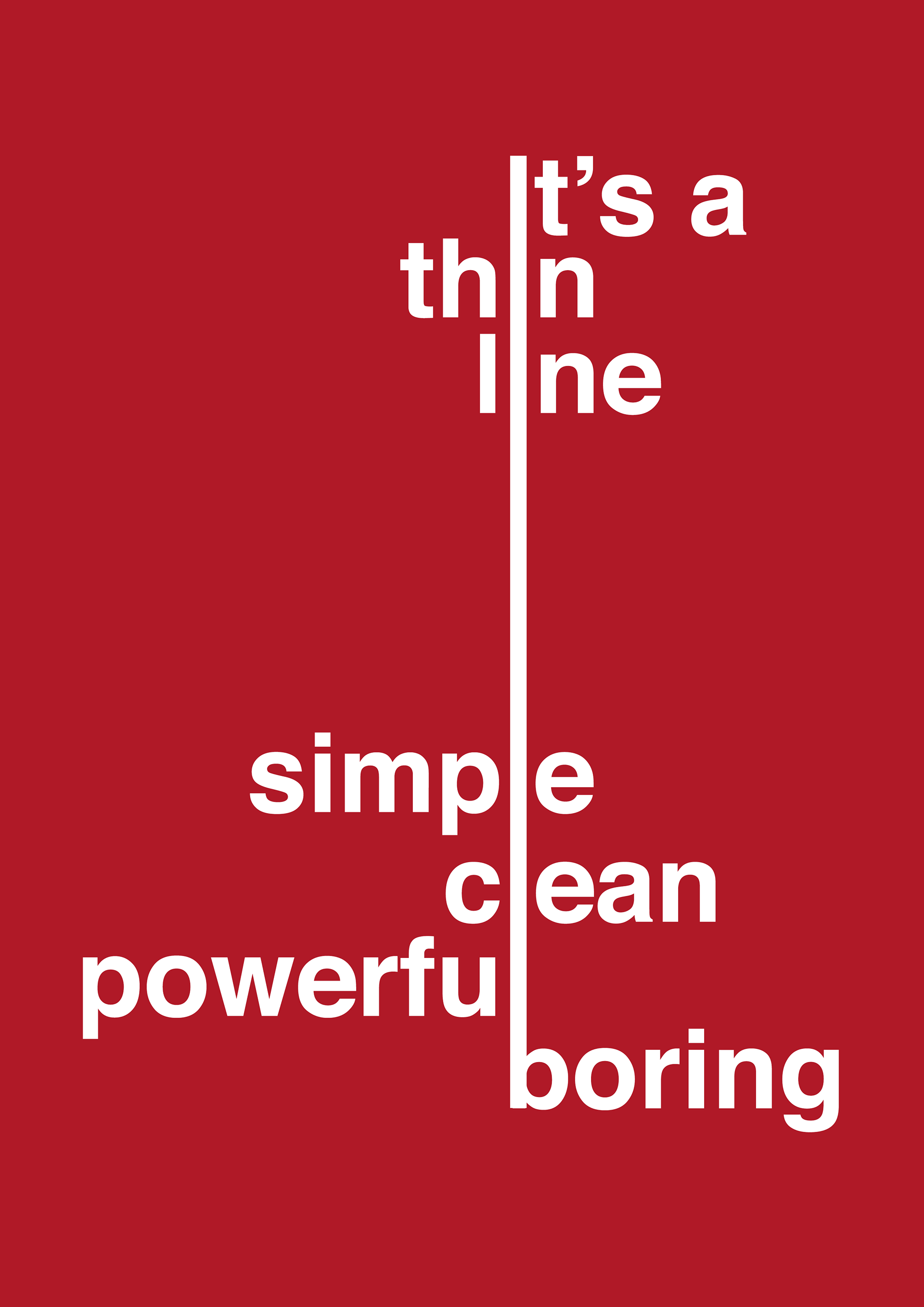
"It's a very thin line between simple and clean and powerful, and simple and clean and boring."
- David Carson
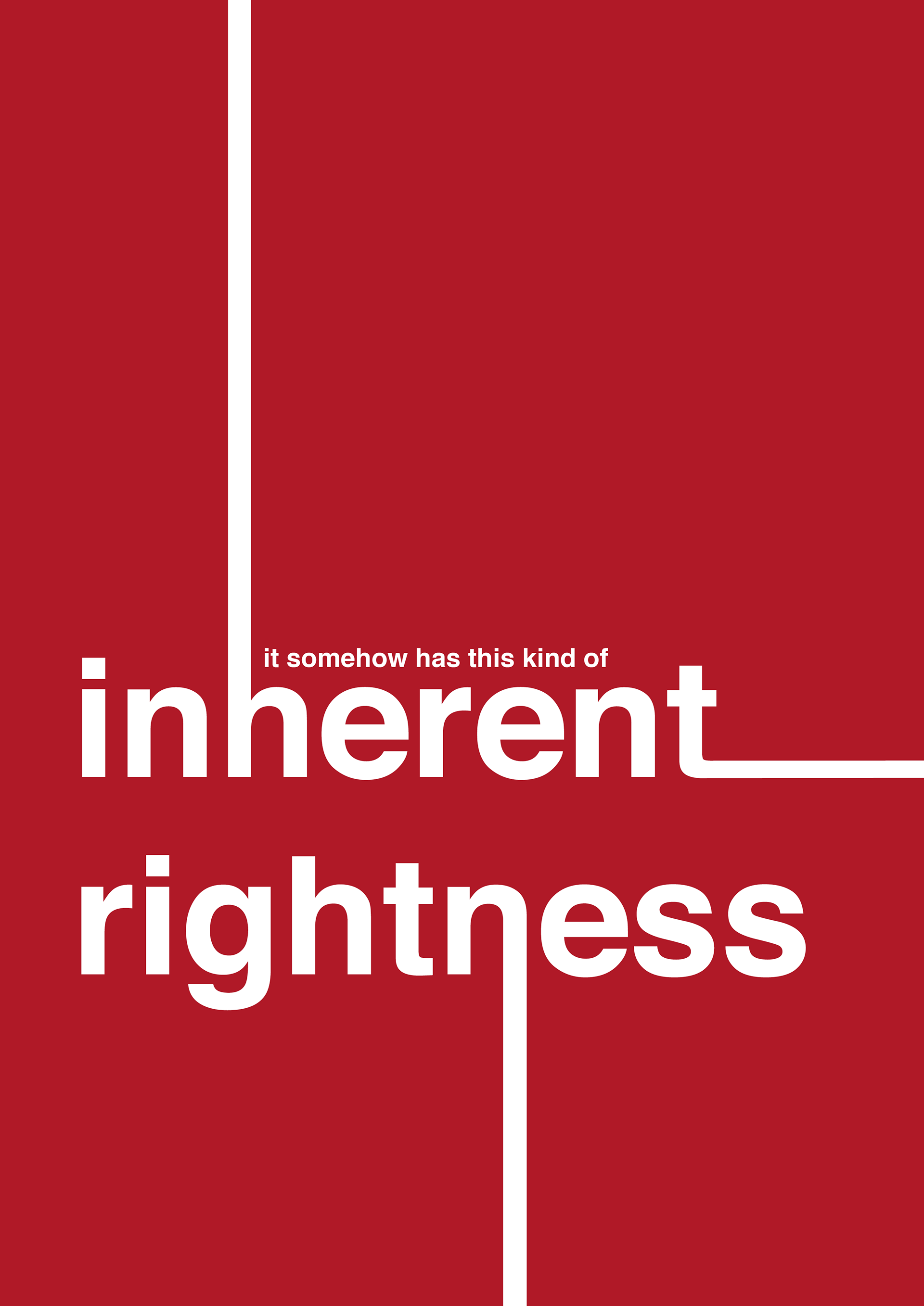
“…It somehow has this kind of inherent rightness. You know, the rightness of the way the lowercase a meets the curve, the rightness of the way the G has a thing that comes down, the rightness of the way the C strokes are like that instead of like that. I wouldn’t have believed that those things actually could be right or wrong as opposed to someone’s taste, yet you have 50 years of history of the thing just sitting there daring people to fix it. It seems to be unfixable.”
- Michael Bierut
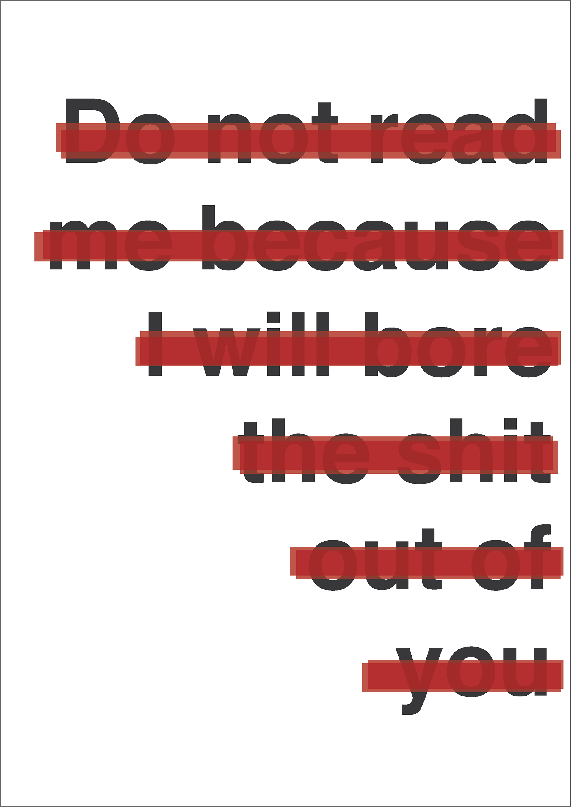
‘If I see a brochure now with lots of white space, six lines of Helvetica and a little abstract logo on the bottom, that says to me: “Do not read me because I will bore the shit out of you.”
- Stefan Sagmeister